Archive
Lies, Damned Lies, Statistics & Facebook
I’ve been impressed with the numbers of people using social networking sites – and the importance of social networking for marketing has become significant over the last few years.
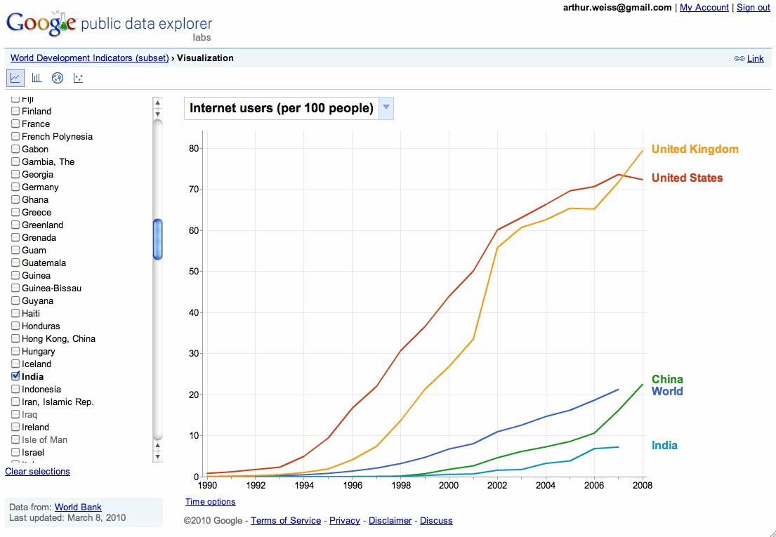
Facebook claims 400 million users (i.e. nearly 6% of the global population that is approaching 7 billion people). I’ve always thought that this figure must include duplicate accounts – as I don’t believe that most people in China, India, Africa and many other areas of the world have Facebook accounts (or even computers – although the numbers are growing). The World Bank stated that there were just under 300m Internet users in China and 52m in India in 2008. (There’s a great graph of this at Google’s Public Data tool – that shows that in 2008 there were around 1.5bn web-users).
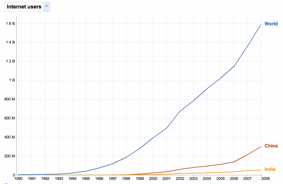
Even taking account the exponential growth – let’s assume that web users globally are now over 2 billion people – Facebook’s figures imply that 1 in 5 users have a Facebook account.
I know of many people who don’t have an account and some who refuse to get one. In my age group (over 40), I’d guess that the majority don’t. So where this 400m figure came from and what it includes is a key question.
It now seems that Facebook has been boosting it’s membership figures. I just read this article from one of my favorite sites (www.pandia.com). Apparently Facebook has been telling advertisers that it has 1.6m users in Oslo. The trouble is that the greater Oslo metropolitan area only has 900,000 people. Facebook apparently counts members by IP address – and I guess that it is feasible that this could include users who access the site via Oslo based web-servers. However not if you consider the next statistic given. The Facebook advertiser tool says that there are 850,000 Facebook users between the ages of 20-29 in Norway – which is 235,000 more than the total numbers (613,000) in that age group.
This over-inflation isn’t just a Norwegian issue. According to CheckFacebook.com (a site that tracks data from the Facebook advertising tool giving Facebook membership numbers), almost 63% of online users in the UK now have a Facebook account. That’s 27m out of a total UK population of 62m. In some countries it’s even higher. Apparently all (100%) Nicaraguan, Qatari and Bangladeshi web users also have a Facebook account, as do 99% of Indonesians, 98% of Filipinos, 97% of Venezuelans, and 85% of Turks.
It’s possible that these statistics are true. However, if so, I’m sure that they also include occasional and infrequent users as well as dormant and duplicated accounts.
One of the most important types of competitive intelligence analysis is to not take everything at face value. When presented with figures, it’s important to sense check them – wherever possible by using other sources (e.g. official population statistics). Only then should such data be used in decision making. You should also ask whether there is an incentive to exaggerate or under-estimate statistics. If there is such an incentive, it is likely that this will be done, at least in the published data. Decisions made using such erroneous or manipulated figures will probably be poor decisions and fail to achieve the expected results. In the case of Facebook, the incentive in exaggerating membership figures is that they can then boost their attractiveness to advertisers, and consequently their advertising revenues.
Google – public data explorer
I’ve just been pointed to a new Googlelabs initiative – the Google Public Data Explorer. This promises to be a useful tool for finding public data in one place. (It’s always worth keeping an eye on GoogleLabs as they often bring out new ideas and products. These are kept together until ready to launch – and can be found from http://www.googlelabs.com.).

Go to AWARE's web-site


 Competitive Intelligence News
- Organic social beats paid 13x on engagement as Hershey’s rewired, marketing intelligence stack exposes hidden performance; shift to real-time decisioning is US breakthrough for Mutinex - Mi-3.com.au
- Northern Light Group Recognized as Leader in Gartner Competitive Intelligence Quadrant - TipRanks
- Sales Teams Lose Competitive Deals Without Disciplined Competitive Intelligence, According to Info-Tech Research Group - PR Newswire
- Five Findings About Today’s Market And Competitive Intelligence Programs - Forrester
- Pomo: $4.5 Million Raised For AI Marketing Intelligence Platform - Pulse 2.0
- My ‘detective’ job as a competitive-intelligence consultant for pharma - Nature
- WPP integrates Google Earth AI to redefine real world marketing intelligence - adobo Magazine
- Data for growth - Part 4: CRM data enrichment: Sales and marketing intelligence with AI - Moody's
- How a Competitive Intelligence Dashboard Enabled Real-Time Market Monitoring for a Global Enterprise | Astute Analytica - Yahoo Finance
- Market Logic Software Included in Latest Market and Competitive Intelligence Platforms Landscape Report - Newswire.com
